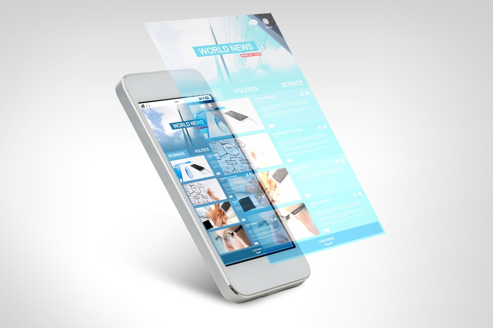
Learning how to construct a mobile site for your customers is more important now than ever before. According to a survey of mobile usage conducted statista.com between 2015 and 2020, more than half of online traffic worldwide occurred on a mobile device. Chances are, customers are visiting your site on their phones more than any other device. It is crucial to design site architecture that can translate from a desktop user to a mobile user without issue. Here are strategies to develop a site that optimizes mobile use while still remaining accessible to all other devices.
Going from desktop to mobile
A user should be able to flip from a desktop browser to a mobile browser and still recognize your pages as the same site, just in a slightly different format. A site that fails to load properly on anything other than a desktop is more likely to lose potential customers visiting for the first time. Before you create an entirely separate page specifically for mobile use, check to see if your site already has a responsive design that can convert the layout from one device to another.
Website responsiveness
Responsiveness refers to a site’s ability to appear cohesive, uniform, and similar on any device, regardless of each device’s screen size. The site’s pages and links should remain the same, with small changes that adapt it for easy mobile use. With newer website templates, this may already be the case. If not, there are plenty of tools available online to help design a website with proper responsiveness.
Strategies to make a mobile site easier to use
Before designing your mobile site, answer several key questions about your audience:
- What information is your audience looking for most often?
- What questions and answers do visitors frequently search for on your website?
- What pages are most popular on your site?
- What do you want customers to know about your business?
When people use mobile devices — frequently phones — they are usually looking for quick answers to short questions. Identifying those questions can help you establish SEO and ideal content for mobile users specifically. You can use Google Analytics to track the traffic that comes to your site to determine what answers people get on your site. From there, consider the following points to implement to make this content more accessible on a mobile platform:
Consistent screen width
There is nothing more irritating than having to scroll horizontally to see an entire webpage on your phone. Make sure that the full width of your site is visible on each screen size. This may mean changing how content appears on the screen.
Expandable images
Since phones offer a limited viewing space, many users prefer images that can expand. This makes it easier to see products and pictures that appear smaller than usual on the screen.
Single tabs only
Moving between separate browser tabs on a small device can be challenging. Ensuring that links to other pages remain in the same tab can minimize user frustration and route customers back to your site.
Discover more ways to make mobile sites
Understanding how to reach the right audience on a mobile platform is a large part of business success. To learn more about how to effectively reach customers by optimizing your mobile site, contact us for help and innovative ideas.
Doctor Genius, located at 16800 Aston Street, Suite 270, Irvine, CA 92606, provides a range of services for practice success. We seek to meet our clients’ needs by providing a variety of marketing, SEO, practice optimization tools, and coaching to transform the healthcare experience. Though we work to provide the most accurate information, the content found on this website is solely intended for entertainment purposes. Therefore, we cannot guarantee that the information provided is entirely correct. You may not use the information on this site to cure, prevent, or diagnose a perceived medical issue. If you have healthcare-related needs, please speak directly to a healthcare professional. Never self-perform medical treatments discussed on this website. All images displayed are also for entertainment purposes only, and personal experiences may differ. Please note that the business tactics mentioned on this site might not be applicable to your industry or practice.

