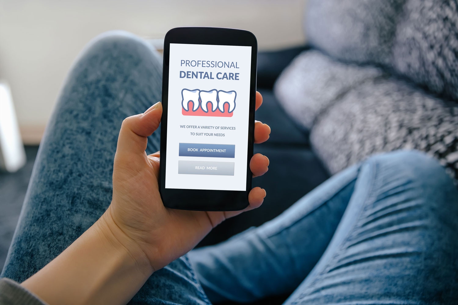
Creating a website that looks amazing on a desktop browser feels like a great accomplishment — until you load the site on your phone and discover it does not look or function the same. This can seem easy to overlook or ignore, but Statista.com reports that over three billion people in the world are mobile phone users, with half of all website visitors generated through a mobile device. If your site translates poorly from a desktop to a mobile device, you could lose an enormous amount of online traffic. Here are some key ways to ensure you have a mobile friendly web design.
Key elements of a mobile website
Website design for dentists does not have to be difficult, even when looking to develop an effective mobile experience. As long as you understand the key elements that create a user-friendly platform on a mobile device, you are already off to a good start. When checking the ease and accessibility of your mobile site, keep these fundamentals in mind and improve upon them if necessary.
Easy navigation
Above everything else, patients need to be able to find the information they are looking for quickly and easily. For this element, site architecture for dental practices must be clean and precise, with a navigation style that makes logical sense. On a mobile site, this layout may need to be more compact than on a desktop. For example, if your desktop has several tabs on the top of the homepage that lead to relevant pages, your mobile site may need a single dropdown menu that, once clicked, displays these tabs. This keeps clutter from your homepage while still presenting the same easy access to the rest of the site.
Formatted responsiveness
To ensure a simple transition from desktop to mobile, consider using a responsive design. Responsiveness refers to the ease in which a site can load the same information on a mobile site, just in a different format. To do this, you can use one of the many web design tools available online or try a template.
Simple readability
Sometimes simple is better, especially for a mobile device. Remember that most devices have limited screen sizes, so your site needs to fill the screen with text that is not too small. A desktop screen may have enough room to include several columns on your site, but a mobile one may require each column to be laid out in consecutive paragraphs. By simplifying the format, you ensure everyone can read content without trouble.
Quick load times
People have far less patience than they used to for website loading speeds. Since so many sites load in just a few seconds, any site that takes longer risks visitors losing interest and departing prematurely. Compressing images, checking your website hosting plan, and using Accelerated Mobile Pages can help decrease load time and increase the number of people who visit your site.
Create a more mobile-friendly site
Site architecture for dental practices can be made easy with services from Doctor Genius. Reach out to discover what we can do to help make your website more mobile friendly.
Doctor Genius, located at 16800 Aston Street, Suite 270, Irvine, CA 92606, provides a range of services for practice success. We seek to meet our clients’ needs by providing a variety of marketing, SEO, practice optimization tools, and coaching to transform the healthcare experience. Though we work to provide the most accurate information, the content found on this website is solely intended for entertainment purposes. Therefore, we cannot guarantee that the information provided is entirely correct. You may not use the information on this site to cure, prevent, or diagnose a perceived medical issue. If you have healthcare-related needs, please speak directly to a healthcare professional. Never self-perform medical treatments discussed on this website. All images displayed are also for entertainment purposes only, and personal experiences may differ. Please note that the business tactics mentioned on this site might not be applicable to your industry or practice.

